
In my previous post on Charticulator I produced a really basic bar chart. This was designed to demonstrate some features I found confusing. And to provide a chart to test the Export to Power BI Custom Visual feature of Charticulator. Having dabbled in Custom Visual development I was interested to see how it would perform.
In Charticulator the Export menu provides an option to save as a Power BI visual. Here are the options for my Bar Chart example:
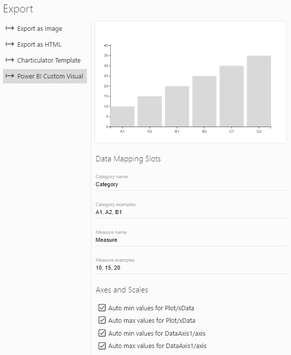
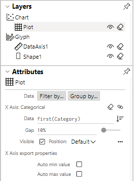
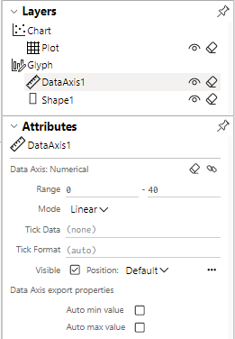
The data mapping slots show the data mapping fields that will be exposed in Power BI. The Axes and Scales options set whether to use the scale values from the data set you used in Charticulator or to calculate them based on the data actually supplied in Power BI. Unless you intend to always use the same data I can’t see why you wouldn’t set them to Auto. In fact not doing so will give some very odd results. Note that these options are the same as those on the object attributes shown below. Also changing them on the export changes them on the object attributes as well:
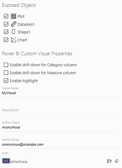
The exposed objects settings show which objects will have properties exposed in the Power BI formatting panel. Again I don’t see why you wouldn’t set them all. I haven’t played with the drill down and highlight options at all yet. And the rest is just meta data that Power BI requires to create a valid visual file.
Hitting the export button downloads a pbiviz file that you can import into Power BI Desktop. I then created a report and data set to use the visual.
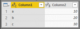
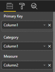
My visual exposed the Category and Measure data fields as expected but also includes a primary key field. I assume that this is required where the Category is not unique but I just set both Primary Key and Category to the same category column.
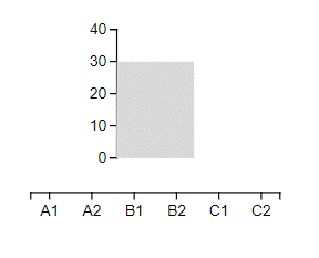
Here is the resulting plot:
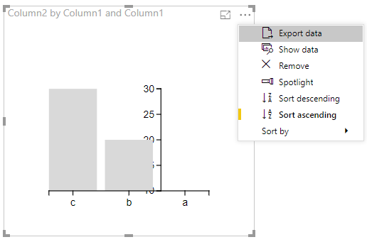
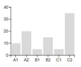
There are two obvious issues. First the position of the Y axis. In Charticulator it appears on the first data point but because of the way Power BI is sorting the data it thinks the last data point is the first. This can be fixed by changing the sort order on the visual. Interestingly this moves the Y axis correctly but does not change the actual ordering on the X axis:
As far as I can tell it’s changing the ordering of the data set but not the order that is displayed in the visual. This can be changed using the Axis Categories property in the DataAxis property group:
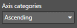
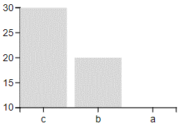
Essentially the Visual sort order and the sort order in the properties pane both have to be set to the same value for the visual to display correctly. The second issue is that Y axis range is auto set to the min data set value to the max. This means the smallest data point never shows as an actual bar! As far as I can see there’s no way to fix this issue.
Export with Fixed Scale Values
As I discussed if you export the visual without setting the Auto options for the axes the visual that you get only really works if you use the same data set as was used in Charticulator. Why you would want a custom visual which can only use one data set I don’t know but here’s how the chart looks. First where the data set is different and the second where I’ve used the same data set in Power BI. As you can see the first makes no sense.
In Conclusion
I may not be doing this all correctly but even with my simple visual the exported visual is not as slick as you might want. Still I’m impressed that it can produce working visual. What would be great would be to be able to access the source code for the visual. This might let Charticulator do the heavy lifting but let the developer tweak the visual to deal with issues like the axis scales. If I get anywhere with that I’ll post it up but it looks like a lot of work so don’t hold your breath.