
Power BI Visuals basically render a bunch of HTML to display a chart. Typically these will be SVG elements and most likely use the D3 library to help draw them. So when I started on developing a Power BI Custom Visual it made sense to develop the chart rendering separately and worry about how to hook it into the Power BI Visual after I was happy with the basic chart logic. This section then is purely D3.
The complete code used in this section is available on GitHub.
The chart I’m going to develop is a Tree Funnel. A funnel chart shows a measure at different stages of a process leading to a desired goal – for example how many leads are moved through each stage of a sales process until a sale is made.
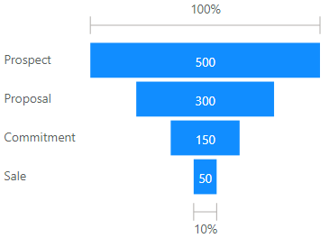
My tree funnel will do something similar but allows the final goal to be segmented into multiple outcomes and focuses more on how prospects are lost during the process. For example, if we are investigating undergraduate students completing their degree we are interested in why some did not complete as intended and the level of award achieved for those that did. The tree funnel could show this as:
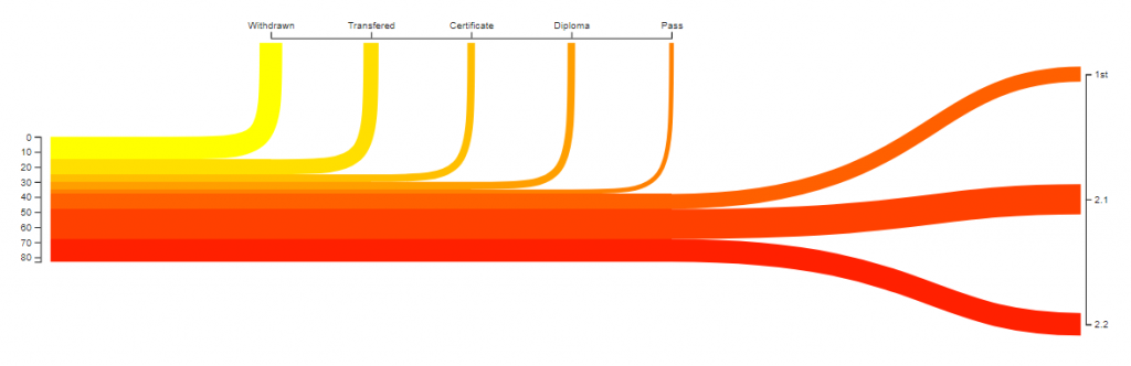
Here the total number of students enrolled on the course is shown by the height of the trunk. Each branch shows the number of students failing to achieve their intended award and each leaf shows the segmentation of the desired outcome – here the level of award achieved.
The data required to populate the chart is simple – a single category to define the branches and leaves and a single measure. Later I will add an additional category to sort by but I’ll do this when setting up the Power BI Visual. For now this is the data I’ll use:
var dataSource = [
{ name: "Withdrawn", value: 15},
{ name: "Transfered", value: 10},
{ name: "Certificate", value: 5},
{ name: "Diploma", value: 5},
{ name: "1st", value: 20},
{ name: "2.1", value: 20},
{ name: "2.2", value: 20}
];
First I’ll set up the basic dimensions of the chart. The width of the chart will be split into the width of the trunk portion (b) and the leaves portion (c). There will also be two vertical axes so the total chart width will be a + b + c + d. The height of the trunk (f) and the height of the leaves (g) will be defined as percentages of the chart height (h). There will be one horizontal axis so the total chart height will be e + h.
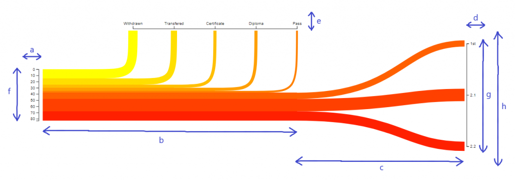
Setting up the dimensions will be the first part of the JavaScript to create the chart. When I move this to Power BI the viewport dimensions, axis sizing and trunk height and width, and leaves height will all be set by the user but for now they’re hardcoded. All other dimensions are derived from these values:
// Set up the dimensions
var viewPortWidth = 1200
var viewPortHeight = 300
var yAxisWidth = 50;
var yLeavesAxisWidth = 50;
var xAxisHeight = 25;
// Calculate the chart size without axes
var width = viewPortWidth - (yAxisWidth + yLeavesAxisWidth);
var height = viewPortHeight - xAxisHeight;
// Size of trunk height and width and leaves height as percentage of chart size
var trunkHeightPercent = .4;
var trunkWidthPercent = .8;
var leavesHeightPercent = .8;
// Branch spacing
var branchSize = 1;
// Calculate trunk height and width and leaves width
var trunkHeight = height * trunkHeightPercent;
var trunkWidth = width * trunkWidthPercent;
var leaveWidth = width - trunkWidth;
// Calculate the range for the leaves Y scale
var leavesRangeStart = ((height / 2) * (1 - leavesHeightPercent));
var leavesRangeEnd = height - leavesRangeStart;
// Calculate the position of the top of the trunk
var trunkTop = (height / 2) - (trunkHeight / 2);
Next I will process the data in the dataSource array generating a new data array which adds in columns.
- runSum – the running sum of array values
- leafRunSum – the running sum of the leaf rows only
- end – bool indicating if the row is a leaf row
And calculates the total value of all rows (trunkDomain) and the total value of all leaf rows (leavesDomain). And creates arrays of all branch row names (branchCategoryValues) and leaf row names (leafCategoryValues).
There is a single variable leaves which specifies the number of rows that are leaves – this number of rows at the end of the dataSource are mapped as leaves. When in Power BI the user will specify this number but for now it’s hard coded. Here’s the data processing code.
// Convert the incoming data into a new data set which adds
// runSum, leafRunSum and end properties
var data = [];
// Leaves defines the number of records that are plotted as leaves. The last X records will in the source
// will be treated as leaves.
var leaves = 3;
var items = dataSource.length;
var branches = items - leaves;
// Leaves domain is the total value of the leaves. TrunkDomain is the total value.
var leavesDomain = 0;
var trunkDomain = 0;
// Branch and leaf category arrays will be used to populate the ordinal axis domains
var branchCategoryValues = [];
var leafCategoryValues = [];
// A running sum of all values and leaves will be added to the data. And a flag indicating the row is a leaf value
var runSum = 0;
var leafRunSum = 0;
var isLeaf = false;


// Process the data array
dataSource.forEach((item, index) => {

trunkDomain += item.value;

// If the row is a leaf
if (index > (branches - 1)) {

leavesDomain += (item.value);
leafCategoryValues.push(item.name);
isLeaf = true;

}
// If the row is branch
else {

branchCategoryValues.push(item.name);

}


data.push({ name: item.name, value: item.value, runSum: runSum, leafRunSum: leafRunSum, end: isLeaf });

runSum += item.value;
if (index > (branches - 1)) {
leafRunSum += item.value;
}


})
Now I have all the data I need to create the chart. Next I’ll set up some scales. First a scale to map the measure values to the height of the trunk. The domain is 0 to the sum of all rows and the range is 0 to the height of the trunk. This scale will be used to set the width of each branch or leaf, position it within the trunk and to draw the left Y axis:
        // Y scale maps the values to a portion of the trunk height
        var yScale = d3.scale.linear()
            .domain([0, trunkDomain])
            .range([0, trunkHeight]);
Next a scale to map each leaf to a height within the leaves section of the chart. The rows will be positioned evenly across this range so an ordinal scale will work for this. The domain will be the category names for each leaf row and the range is the start and end heights of leaves section. This scale will be used to position the height of the end of each leaf and to draw the right Y axis:
        // Y scale leaves maps the leaf category values to a position on the leaves height
        var yScaleLeavesOrdinal = d3.scale.ordinal()
            .domain(leafCategoryValues)
            .rangePoints([leavesRangeStart, leavesRangeEnd]);
Then a scale to map each branch category to its end width position along the trunk width. Like the yScaleLeavesOrdinal this will evenly space each branch across the trunk width but because some additional space is required to accommodate the start of the trunk and the curve of the branch I’ve used a linear scale where the domain is 0 to number of branches + 1 and the range starts one branch width in. Because this is a linear scale an additional ordinal scale is required to draw the top axis:
        // X scale maps the branch categories by position to a position on the trunk width

        var xScale = d3.scale.linear()
            .domain([0, branches+1])
            .range([trunkWidth / (branches + 1) , trunkWidth]);

        // X scale ordinal maps the branch categories to a postion on the trunk width
        var xScaleOrdinal = d3.scale.ordinal()
            .domain(branchCategoryValues)
            .rangePoints([xScale(branchSize), xScale((branches-1)+branchSize)]);
Finally a linear scale that maps each leaf and branch to a colour. Here I’ve hardcoded a range between yellow and red but in Power BI this will be set by the user:
        // Colour scale maps each category to a colour within the specified range
        var colourScale = d3.scale.linear()
            .domain([0, items])
            .range(['yellow', 'red']);
Next I set up the three axes:
        //create left axis
        var yAxis = d3.svg.axis()
            .scale(yScale)
            .orient("left");

        //create top axis
        var xAxisOrdinal = d3.svg.axis()
            .scale(xScaleOrdinal)
            .orient("top");

        //create right axis
        var yAxisLeavesOrdinal = d3.svg.axis()
            .scale(yScaleLeavesOrdinal)
            .orient("right");
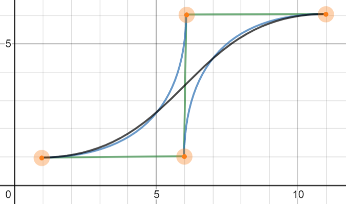
And now I can start drawing each line. A row of data will be a line on the chart. Each line will be a path with a stroke width proportionate to the size of the row’s measure. Each branch will be composed of a horizontal line of length proportional to the number of the row followed by a Bezier curve extending one branch width and that ends at the top of chart. Both control points will be 1 branch width along the horizontal – like this:
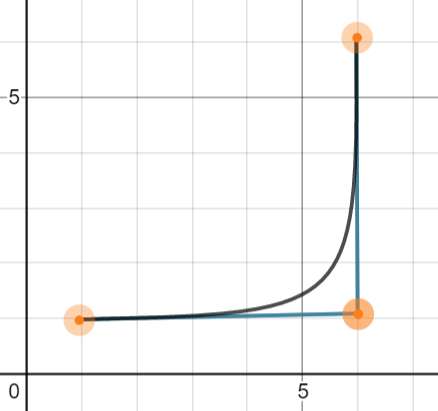
Leaves will have a horizontal the same length as the longest branch followed by a Bezier where the end point is at the end of chart and each row is evenly distributed along the height of the leaves height. The first control point will be on the horizontal height and halfway along the width between the curve start and end and the second will be at the same width and the height of the endpoint:
To do all that I’ll define a function getLine that given a data point will return a path. Notice that the initial height (trunkPos) is the yScale value of the total of all previous rows and half the current row. This means everything will fit together nicely when the stroke width of the line is set based on the row’s value. This value then needs to be shifted down to the top of the trunk (trunkTop).
        // function to generate the path for each value
        var getLine =
            function (d, i) {

                // Get the mid point position on the yScale for this value.
                // Add in trunk top to position it below the start of the trunk top.
                var trunkPos = yScale(d.runSum + (d.value / 2)) + trunkTop;
                var moveToTop = "M 0, " + trunkPos + " ";

                // If the value is a branch
                if (!d.end) {

                    // Get the X position of the end of the line from the xScale and generate horizontal
                    var horizontalLine = "H " + xScale(i) + " ";
                    // Get the position of the control points from the xScale and generate a bezier
                    var control1 = xScale(i + branchSize) + "," + trunkPos + " ";
                    var control2 = xScale(i + branchSize) + "," + trunkPos + " ";
                    var endPoint = xScale(i + branchSize )  + "," + 0 + " ";

                }

                // for outcome values
                else {

                    // Get the position of the end of the line from the xScale and generate horizontal
                    var horizontalLine = "H " + xScale(branches) + " ";
                    // Get the Y position of the leaf end point
                    var yPosition = yScaleLeavesOrdinal(d.name);
                    // Generate the bezier
                    var control1 = (trunkWidth + (leaveWidth / 2)) + "," + trunkPos + " ";
                    var control2 = (trunkWidth + (leaveWidth / 2) ) + "," + yPosition + " ";
                    var endPoint = (width) + "," + yPosition + " ";

                    }

                return moveToTop + horizontalLine + "C " + control1 + control2 + endPoint;

        }
And that’s all the hard stuff done. Now it’s just a matter of adding the elements. First a container to hold the chart (without axes) and translate that to the right and below where the left and top axes will be:
        // Select the chart object
        var chart = d3.select(".chart");

        // Add a container to hold the chart and move it below and right of the axis
        var container = chart.append("g")
            .attr("transform", "translate(" + yAxisWidth + ", " + xAxisHeight + ")");
Then add an element for each line:
        // Add an element for each data point
        var line = container.selectAll("g")
            .data(data)
            .enter()
            .append("g");
And set the lines attributes. The stroke colour will be derived from colour Scale using the index of the row and the stroke width from the yScale using the row value. The path is calculated by the getLine function discussed above:
        // Set the path options and add the whole line

        line.append("path")
            .attr("stroke", function (d,i) {return colourScale(i)})
            .attr("stroke-width", function (d) { return yScale(d.value) })
            .attr("fill", "none")
            .attr("shape-rendering", "geometricPrecision")
            .attr("d", getLine);
Finally add in the axes and translate them to their correct positions:
        // Add axes and translate them into place

        chart.append("g")
            .call(yAxis)
            .attr("class", "axis")
            .attr("transform", "translate(" + (yAxisWidth -10) + ", " + (xAxisHeight + trunkTop) + ")");

        chart.append("g")
            .call(xAxisOrdinal)
            .attr("class", "axis")
            .attr("transform", "translate(" + (yAxisWidth) + ", " + (xAxisHeight - 5) + ")");

        chart.append("g")
            .call(yAxisLeavesOrdinal)
            .attr("class", "axis")
            .attr("transform", "translate(" + (yAxisWidth + width + 5) + ", " + (xAxisHeight) + ")");
And that’s that. The HTML element the script selects is below. Except… one issue that I found with the rendering of the SVG. In order not to bloat this section too much I’ve detailed it separately. The next section explains how set up a custom Power BI visual and replicate this chart logic there.
<!DOCTYPE html>

<html>
<head>
    <meta charset="utf-8" />
    <script src="https://d3js.org/d3.v3.min.js" charset="utf-8"></script>

    <title></title>
    <style>

        .axis path,
        .axis line {
            fill: none;
            stroke: #000;
            shape-rendering: crispEdges;
            }

        .axis text {
            font: 9px sans-serif;
            fill: black;
        }

    </style>
</head>
<body>

    <svg class="chart" width="1200" height="300">

    </svg>


</body>
</html>