
In understanding how to access the data in a custom visual I found AB Kimmel’s tutorial incredibly helpful. Here I’m just going to go through the options I need, for a broader explanation I’d recommend reading his sections on data views. There are four steps to go through. First specify what data can be added to the visual via the Fields pane – this data will then be accessible via the dataview. Then create a data model to hold this data and a function to populate it from the dataview. And finally use the data model data to draw the visual.
The complete code used in this section is available on GitHub.
Specifying the Data Views
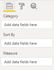
The Trunnel visual will need three fields in the Fields pane. Category and Measure which will be required, and an optional Sort By field. Here’s how they’ll look.
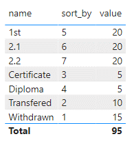
The Category and Measure will provide the name and magnitude of each data point. The Sort By data won’t actually be used in the visual. It’s there only so users can add an alternative column to sort the data by. Here’s a sample table of data that I’ll use for testing.
The data fields are defined in the capabilities.json file. Initially it will contain the settings from the default template which I’ll delete leaving just the empty object. In here I’ll need to specify dataRoles, dataViewMappings and sorting.
{
"dataRoles": [],
"dataViewMappings": [],
"sorting": {}
}
First I’ll define the dataRoles – these specify the fields that will appear in the fields pane. And they’re straightforward – just requiring name and kind and the type of data that are permitted. For the Trunnel fields they’ll look like this.
    "dataRoles": [

        {
            "displayName": "Category",
            "name": "category",
            "kind": "Grouping",
            "requiredTypes": [
                {
                    "text": true
                },
                {
                    "numeric": true
                }
            ],
            "description": "Category"
        },
        {
            "displayName": "Sort By",
            "name": "sortBy",
            "kind": "Grouping",
            "requiredTypes": [
                {
                    "text": true
                },
                {
                    "numeric": true
                }
            ],
            "description": "Sort by"
        },
        {
            "displayName": "Measure",
            "name": "measure",
            "kind": "Measure",
            "description": "Measure"
        }
    ]
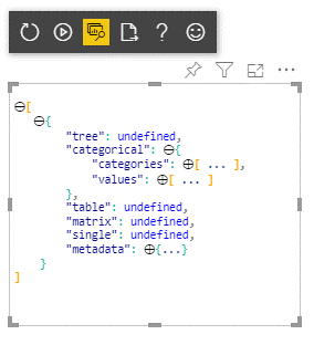
This will render the fields on the fields pane but no data can be added to them until they are mapped to the dataview – this is the structure that holds all the visual data. The fields can be mapped to one of several types of dataview (single, categorical, table, matrix and tree). The one I require, and which seems to be best for most common scenarios is the categorical dataview which maps data to a set of categories and values. You can examine the structure of the dataviews when running the Developer Visual in Power BI Service – click the Show Data View button and you can examine the structure and data. An object is provided for each type of dataview but only the dataview that has been defined in capabilities will be defined.
So, back to capabilities.json. I need to add a dataViewMappings object and include a specification for the categorical data view.
    "dataViewMappings": [

        {
            "categorical": {

                "categories": {
                    "select": [{"bind": {"to": "category"}}, {"bind": {"to": "sortBy"}}]
                },
                "values": {
                    "bind": {"to": "measure"}
                }
            }

}]
In the categorical object there’s a mapping for categories and for values. The categories mapping needs to create two sets of values and the select does this, binding the data in the category and sortBy fields to categories. Since there is only one values field the select is not required when binding in the values section. Bind To is intended to be used where a field will only have ever have one column applied to it. If a field allows multiple columns use “for”: {“in”: “”}. But how to specify how many columns can be added to a field – this is done by adding the conditions object to dataViewMappings.
            "conditions": [

                {
                    "category": {
                        "max": 1
                    },
                    "sortBy": {
                        "max": 1
                    },
                    "measure": {
                        "max": 1
                    }
                }
            ]
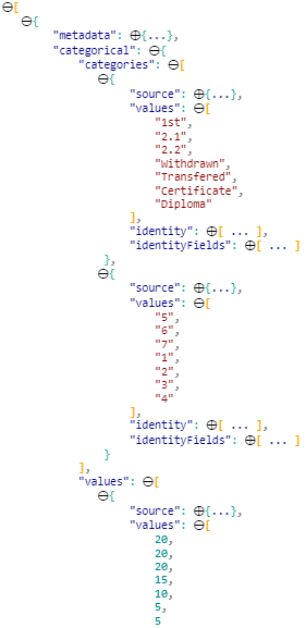
If I now drop in some columns to each field in the developer visual and examine the dataview it will look something like this.
Specifying Sorting
It is possible to explicitly specify how the visual data is sorted but the most common approach is to leave this to the user. In order to enable user sorting we have to add:
    "sorting": {
        "default": {}
    }
Create the Data Model
Now the visual can accept data that will be reflected in the dataview I need to create a structure into which I will process the dataview data. This should be familiar from the data structure used in the D3 only chart section. Each data point will be a TrunnelItem with category name, measure value, running sum of all values up to this point, flag indicating if this is a leaf data point and running sum of the leaves up to this point.
export interface TrunnelItem {

    category: string | number;
    measure: number;
    runSum: number;
    leafRunSum: number;
    isLeaf: boolean;

}
TrunnelItems will contain an array of Items as well as category names for branches and leaves. And counts and sums of branches and leaves:
export interface TrunnelItems {

    items: TrunnelItem[];
    branchCategoryValues: string[];
    leafCategoryValues: string[];
    itemCount: number;
    branchesCount: number;
    leavesCount: number;
    branchesSum: number;
    leavesSum: number;

}
These interfaces are added to the visual.ts file. Next, again in visual.ts I’ll add a function to take a DataView and process the data into TunnelItems.
Populating the Data Model
The dataExtraction code should be pretty self-explanatory. The category and values are accessed from the dataview via:
        let categoryColumn = dataView.categorical.categories[0];
        let categoryValues = categoryColumn.values;
        let valueColumn = dataView.categorical.values[0];
        let valueValues = valueColumn.values;
You can then access each value in the array using the valueOf() method but since the type is undefined at this point a cast is required:
            let category = categoryValues[i].valueOf() as string | number;
            let measure = valueValues[i].valueOf() as number;
In the final visual the number of data points to be treated as leaves will be set by the user in the visual properties – but at this point these have not been implemented so I’ll just hardcode this value to 1:
let leavesCount: number = 1;
Here’s the full function:
private dataExtraction(dataView: DataView): TrunnelItems {


        let branchesSum: number = 0;
        let leavesSum: number = 0;
        let runSum: number = 0;
        let leafRunSum: number = 0;
        let isLeaf: boolean = false;

        let items = [];
        let categoryColumn = dataView.categorical.categories[0];
        let categoryValues = categoryColumn.values;
        let valueColumn = dataView.categorical.values[0];
        let valueValues = valueColumn.values;

        let itemCount: number = categoryValues.length;
        let leavesCount: number = 1;
        let branchesCount: number = itemCount - leavesCount;
        let branchCategoryValues = [];
        let leafCategoryValues = [];


        for (let i = 0; i < categoryValues.length; i++) {

            let category = categoryValues[i].valueOf() as string | number;
            let measure = valueValues[i].valueOf() as number;

            //leaves
            if (i > branchesCount - 1) {
                leavesSum += measure;
                isLeaf = true;
                leafCategoryValues.push(category);

            }
            //braches
            else {
                branchesSum += measure;
                branchCategoryValues.push(category);

            }


            let branch: TrunnelItem = {
                category,
                measure,
                runSum,
                leafRunSum,
                isLeaf
            }

            items.push(branch);

            runSum += measure;
            if (i > branchesCount - 1) {
                leafRunSum += measure;
            }

        }


        return {
            items, branchCategoryValues, leafCategoryValues, itemCount, branchesCount, leavesCount, branchesSum, leavesSum
        };

    }
Finally add a property to the Visual class to hold the data model.
private trunnelItems: TrunnelItems;
Using the Data Model Data
That’s all the spadework done. I’ll now change the visual.ts update method to populate the data model and use this instead of the hard coded data to generate the chart. First off call dataExtraction to populate the data model from the dataview.
        let dataView: DataView = options.dataViews[0];
        let trunnelItems: TrunnelItems = this.dataExtraction(dataView);
        this.trunnelItems = trunnelItems;
Next delete the static data and data processing: remove everything in:
       var dataSource = [        ];


        // Process the data array
        dataSource.forEach((item, index) => {

        })

        // Convert the incoming data into a new data set which adds
        // runSum, leafRunSum and end properties
        var data = [];
        // Leaves defines the number of records that are plotted as leaves. The last X records will in the source
        // will be treated as leaves.
        var leaves = 3;
        var items = dataSource.length;
        var branches = items - leaves;
        // Leaves domain is the total value of the leaves. TrunkDomain is the total value.
        var leavesDomain = 0;
        var trunkDomain = 0;
        // Branch and leaf category arrays will be used to populate the ordinal axis domains
        var branchCategoryValues = [];
        var leafCategoryValues = [];
        // A running sum of all values and leaves will be added to the data. And a flag indicating the row is a leaf value
        var runSum = 0;
        var leafRunSum = 0;
        var isLeaf = false;
And replace them with:
        var trunkDomain = trunnelItems.branchesSum + trunnelItems.leavesSum;
        var leafCategoryValues = trunnelItems.leafCategoryValues;
        var branches = trunnelItems.branchesCount;
        var branchCategoryValues = trunnelItems.branchCategoryValues;
        var items = trunnelItems.itemCount;
        var data = trunnelItems.items;
All the data for drawing the visual is now coming from the dataview via the data model. Unfortunately I’ve used slightly different property names for on the data model to the old static data so I need to make the following changes to visual rendering code:
- All instances of d.value change to d.measure
- All instances of d.end change to d.isLeaf
I can now run the visual in Power BI and add data to it like a proper working chart! In the next section I’ll add the formatting options which will provide user control over the chart appearance.