
The Power BI shape map allows you to create simple choropleths (a map where the shading of a map region indicates some value) but comes with a very limited set of map regions. For the UK you only get UK countries so if you want to show other UK regions, you’ll have to source additional maps. Here I’ll show how you can map student applications by UK NUTS regions (Nomenclature of Territorial Units for Statistics).
NUTS regions are a Europewide hierarchy of regions with 5 levels in the UK. NUTS levels 1, 2 and 3 and LAU (Local Administrative units) levels 1 and 2. LAU level 1 goes down to local authority districts and unitary authorities and level 2 down to individual wards. You can read more about the structure here.
In order to show these regions we need a GeoJSON file that describes the region boundaries. Fortunately these are available at data.gov.uk. The following table provides links to each level where you can download the GeoJSON files.
| Level | Regions |
|---|---|
| NUTS1 | Wales; Scotland; Northern Ireland; 9 statistical regions in England |
| NUTS2 | Northern Ireland; counties in England (most grouped); groups of districts in Greater London; groups of unitary authorities in Wales; groups of council areas in Scotland |
| NUTS3 | Counties; unitary authorities; or districts in England (some grouped); groups of unitary authorities in Wales; groups of council areas in Scotland; groups of districts in Northern Ireland |
| LAU1 | Lower tier authorities (districts) or individual unitary authorities (England and Wales); Individual unitary authorities or LECs (or parts thereof) (Scotland); Districts (Northern Ireland) |
| LAU2 | Wards (or parts thereof) |
The shape map visual only accepts maps in the slightly different TopoJSON format so the next job is to convert these GeoJSON files. Mapshaper will let us do this. Drop the GeoJSON files here and you can export as TopoJSON. However these maps are very detailed (100MB+) and I found Power BI struggled with them. Mapshaper also includes a Simplify option you can run before exporting – you can easily reduce the level of detail to 5% of the original with no real loss of quality.
Next we need to map our data to the regions. Each region in each file has several keys that identify a region. Here’s a sample from the NUTS3 file:
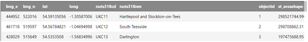
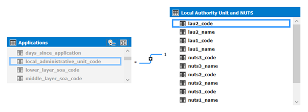
If you want to view these maps, the map keys and even edit these attributes geojson is a great tool for this. But anyway, on with the mapping. We’ll want to map our applications data to the LAU2 code (the lowest level in the hierarchy). Assuming we have a postcode associated with an application we get the LAU2 code from ONS postcode data that is also available to download from ONS .
In this dataset we need the postcode file (ONSPD_NOV_2018_UK.csv) and the NUTS hierarchy file (LAU218_LAU118_NUTS318_NUTS218_NUTS118_UK_LU_NSPD.csv). The postcode file contains all UK postcodes and includes their LAU2 code (it’s the NUTS column in the file). This is the foreign key to the lowest level of the NUTS hierarchy (LAU2). So we can join applications on postcode to the postcode file to get the NUTS code and join to the NUTS hierarchy on the column LAU218CD. I’m not going to go through the ETL for this but just to say I would not include the large postcode file in the final Power BI model – put the NUTS code on the applications fact table and join directly to the NUTS hierarchy table to avoid the high cardinality joins to postcodes.
Supposing then that we have an applications fact table including the LAU2 code joined to a NUTS hierarchy table.
We can now create a shape map. I’m going to use NUTS level 3 for the first map. Add a new shape map visual and in the fields add the NUT3_code in as the location and an application count measure for the saturation.
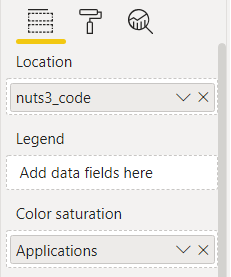
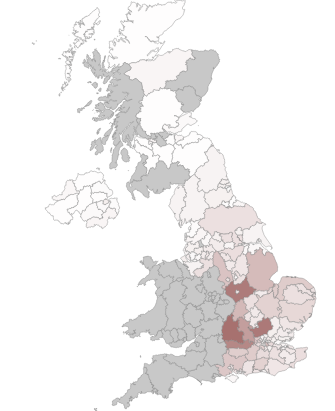
Now go to the Format menu and open the Shape menu (note that the shape menu is not available until you’ve added some data to the visual – you can’t add the shape map until you’ve added data fields). Click add map and select the TopoJSON map we created above for NUTS3 regions. The map should look a bit like this.
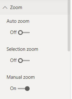
Play around with the data colors options until you get the effect you want. I also found the map worked best with Auto Zoom and Selection Zoom turned off.
Tooltips
One thing you can’t do with this map is label the regions. The best you can do is add the region names as tool tips. If you use the region name as the tooltip it will count it rather than show the name so, create a new measure and use this as the tooltip instead:
FIRSTNONBLANK('Local Authority Unit and NUTS'[nuts3_name], "NA")
Drill Down
The shape map has no drill down either, but we can use Drill Through to produce similar functionality. Create a new report page and shape map with the location field as lau2_code. This time add the TopoJSON map for LAU2 regions as the shape map. Add the nuts3_code as a drilldown field on the report page. You should now be able to drill down from the NUTS3 level map regions to the LAU2 level. If you set the Auto Zoom option to on for the drill through map it will automatically zoom to the drill through area.
Final Thoughts
There are other map visuals out there with more functionality than the standard shape map but you’ll still need to source and map your data to use them and hopefully this gives you some ideas about how to do this. You also don’t need to be limited geographic maps. You can draw any shapes using the shape map which could represent rooms in a building, an office layout or even a process flow diagram. Here’s an example of how to produce a room utilisation visual using the shape map.