
A graphical tool for developing complex chart designs in minutes that can be exported as custom visuals directly to Power BI. Too good to be true? Maybe, but Charticulator is still an amazing bit of kit and to be fair it’s primarily intended to produce charts for the Web not for Power BI.
Charticulator is developed by Microsoft Research which means some very smart people worked on it and though there are plenty of tutorial examples as a lesser mortal I struggled a bit to understand how everything worked. So I’m sharing a very basic example here which explains the issues that confused me. In a separate post I’ll talk about how the export to Power BI and whether it really works.
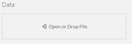
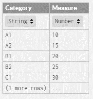
I’m producing a basic bar chart which doesn’t show the power of the tool but does illustrate the points I want to make. When you open Charticulator it will ask for a data set. I’ve created a CSV with a category and measure column and drop this in.
Confirming this takes us to the main UI. Here there are two canvases – the Glyph window and the Chart window. The Glyph window is where you define how a data point will look and the chart window will show how data points are arranged in the chart. In addition a window for the columns in the data source and for the objects in the chart and their properties. Initially the chart will include just a PlotSegment – an area on the chart that contains the datapoints and an empty Glyph.
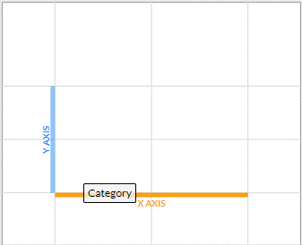
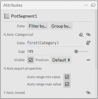
First I’ll add a category X axis to the chart – to do this drag the Category column onto the chart window and onto the highlighted axis. This will bind the data to the X axis and let us adjust the properties of the axis in the plot segment attributes.
This binding is now reflected in the attributes of the plot segment.
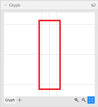
Next in the glyph window click the Fit to Window (my name for this icon since there’s no tooltip). This ensures the whole glyph area is displayed (as highlighted below). You can extend elements beyond this area but this may cause data points to overlap or overflow the chart area.
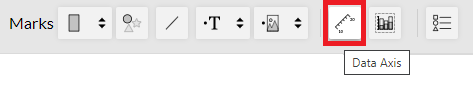
Now I need to add a Data Axis that will control the height of each bar and display a Y axis.
The data axis is actually a data driven guide and is called this in the tutorials but confusingly in the UI it’s a data axis. A data driven guide is a way of mapping data points to attributes of a graphical element – in my case the height of a bar in a bar chart. This is much more elegantly explained with better examples here.
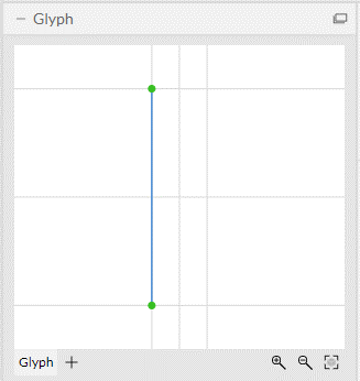
Click the Data Axis tool and in the glyph window draw the axis from the bottom left to the top left of the glyph area. Drawing direction matters – the direction you draw in will set the ordering of axis. And I cannot see anyway to change it once it’s drawn.
Now drag the measure column to the data axis to bind the data to it.
In the attributes of the DataAxis I need to change the range (If I don’t it will make binding the bars of the chart to the Data Axis impossible).
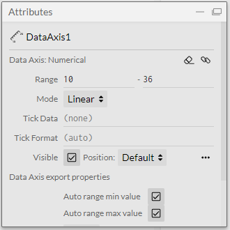
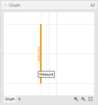
Change the range to 0 to 40. The Data Axis in the glyph will now look like this.
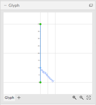
The measure mapped to the axis shows up at 10. This is just the first value in the data set and is not significant – it’s just a point on the axis that represents the data we want to drive the height of the bars in the bar chart. Select the rectangle shape mark and draw a rectangle in the glyph window from the bottom right corner to where measure is marked on the axis – it will snap to the guide at this point. This binds the height of the shape to the value of measure. As far as I can tell this is not shown in the attributes of the guide – only the fact that the top of the shape is locked to the guide in the glyph window reflects this relationship.
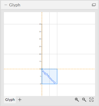
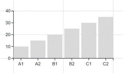
Note if we hadn’t changed the axis range above the Measure guide would be at zero and it would have been impossible to draw the rectangle between the bottom of the glyph and the Measure guide since they would both be a zero! The chart now looks like this.
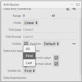
Note that the Y axis is a property of the glyph not the chart so it’s on every data point. By default however it is only displayed on the first data point. You can see this in the attributes for the Data Axis.
Obviously a bar chart (the “hello world” of visualisations!) does not make best use of the tools in this application but hopefully it explains some of the trickier parts of the UI that are not obvious from the official tutorials. In a later post I’ll show how to export this as a Power BI visual and some of the resulting issues.